Tuesday, September 24, 2013

Coffee cans... mid-century at its best

The other day I had the pleasure of seeing a lovely collection of coffee cans, which are straight sided cups introduced in the early 1960s. It's great when a collector focuses on one range and you get a whole lot of allied objects - thanks Jeremy Ashford for this treat. Just look at this gorgeous thing!
This set has a Kelston Potteries backstamp, which is relatively unusual. Jeremy also has a brown version of the same pattern.
 Many coffee cans are marked with Cook & Serve, a brand which was introduced in 1963 when a heat resistant clay body was first developed.  The first Cook & Serve coffee cans were Blue Tango, Allegro, Image, and Mogambo - used in a Gregg's Instant Coffee advertisement. At first they were hand painted; later transfers were used.
I remember the Gregg's coffee advertisement, it seemed so very sophisticated and romantic when I was a young(ish!) girl.
Below is Blue Tango, an entry by Emilie Beuth in the Crown Lynn design competition. The pattern was later used on all the Government-owned Tourist Hotel Corporation china. It first appeared in the Chateau Tongariro in mid-1966. Blue was used in the North Island, burgundy in the South Island.
Unusual coffee can patterns include Allegro - also hand painted,
Mexico - hand painted
And this pattern -I've forgotten its name - shown here with a green cup. There was also a cup in the same pattern as the saucer but I think this combination looks better.
NOTE - when I first did this post, I had the pattern above described as Napoli, but I got that wrong, it's called Form.

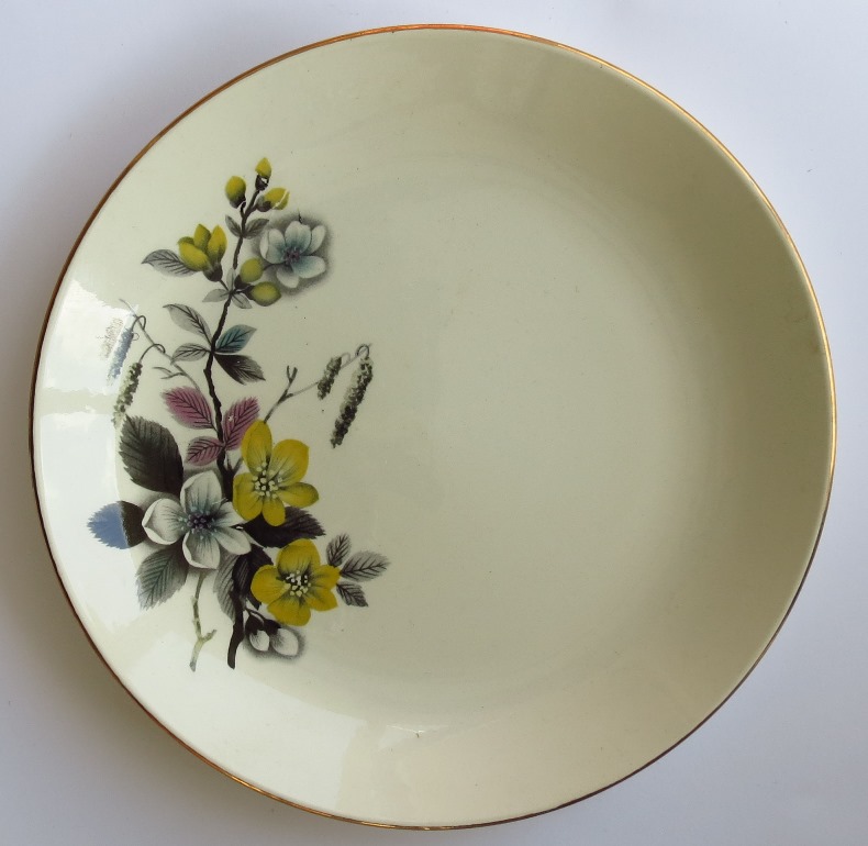
This is Napoli, a very close imitation of a Swedish Norstrand pattern - of which more next time.
The Napoli backstamp is interesting - who were W.B and Coy?
This is an Arthur and Martha cup, its backstamp is a different style from the others. (and it's a bit dusty - I should have been more careful!)

And this odd little number is Purple Myrtle, not easy to find, with a similar backstamp to Arthur and Martha. There is also a mysterious Captain Sharples mug in the same series - I have no idea who Captain Sharples was! 
Alongside the Cook & Serve coffee cans, Crown Lynn made stylish coffee pots, also branded Cook & Serve. This example is Blue Tango.
And lastly, here is a very oddly decorated coffee pot - goodness knows whose experiment it was... it would look so very much better in plain white.
I guess experiments weren't always successful - and anyway it's all a matter of personal taste, isn't it? 
 
NOTE - since I wrote this, Ev from NZ Pottery has pointed out that this pattern does have a name - Sunburst. So I herewith wash my mouth out with soap.... don't be so disparaging Valerie!
 
Next time I will talk about the crossover between Crown Lynn patterns and those from overseas manufacturers... there is a Cook & Serve pattern which is a direct replica of the Swedish Nortstrand product. And another in the popular Fleurette, a copy of Belle Fiore.
 
Take care till then... and remember it's only a boat race!
ValM
 

Wednesday, September 11, 2013

Mysteries solved - Crossfords and Syrem....

This is a Crossfords Kiwi Family plate - a cute pic but until recently I had absolutely no info about it, despite much googling and enquiring.

Then out of the blue I got an email from a friend who knew the person who designed it!  So here's the story of Bettina McCulloch and the Crossfords Kiwi Family. 

In the early 1980s Bettina was a signwriter for Hugh Wrights Menswear shop in Auckland.  The small team worked from a studio in Exchange Lane off Queen St and in their down time they did design work for Crossfords, a nearby souvenir shop. Bettina believes that most of these plates were sold to tourists and are probably overseas - certainly you don't see many around.

During the early 1980s Bettina also designed a range of sew-on badges for Crossfords - here are a few examples. I saw one for sale on TradeMe the other day.
Since leaving Hugh Wrights, Bettina has continued with her commercial art work, among other things she has designed ceramic tiles and murals.

I believe I have also found an answer to the Syrem question.  On 4 November 2012 I devoted a whole post to items with Syrem backstamps. I could not of the life of me find out what Syrem meant - the only thing I found was obscure references in German... then the lovely Alan Topham, long-term Crown Lynn marketing manager and later GM, had a flash of inspiration - he believes that Syrem was an anagram for Myers, an Australian chain which he recalled had a department store in Wellington. This is a Teddy Syrem plate.

And this is a Syrem lunch/cake plate.
 
 
Note this later research from Ev on the NZ Pottery site:  Thought I had recalled seeing Myers in the Decoration Advices and took a look. How wonderful to find that Florida Pat.No. 957 was made for Myers in around 1965!! Ivy Leaf Pat.No. 979 is listed as a J. Myers Ltd Exclusive around 1967!
 
Alan also enlightened me on another long-standing question - why are several Crown Lynn patterns named Sylvia - Sylvia Blossom Time, Sylvia Corvette, Sylvia Rose, etc etc. Alan told me that for many years Tom Clark had a secretary called Sylvia Dunbar, and these patterns may have been named after her - a nice thought!  Here are a couple of pretty Sylvia patterns. Once again, what lovely backstamps. This is Sylvia Blossom Time:

 
And here is Sylvia Rose Kelston:
 
 
More soon
Take care
ValM